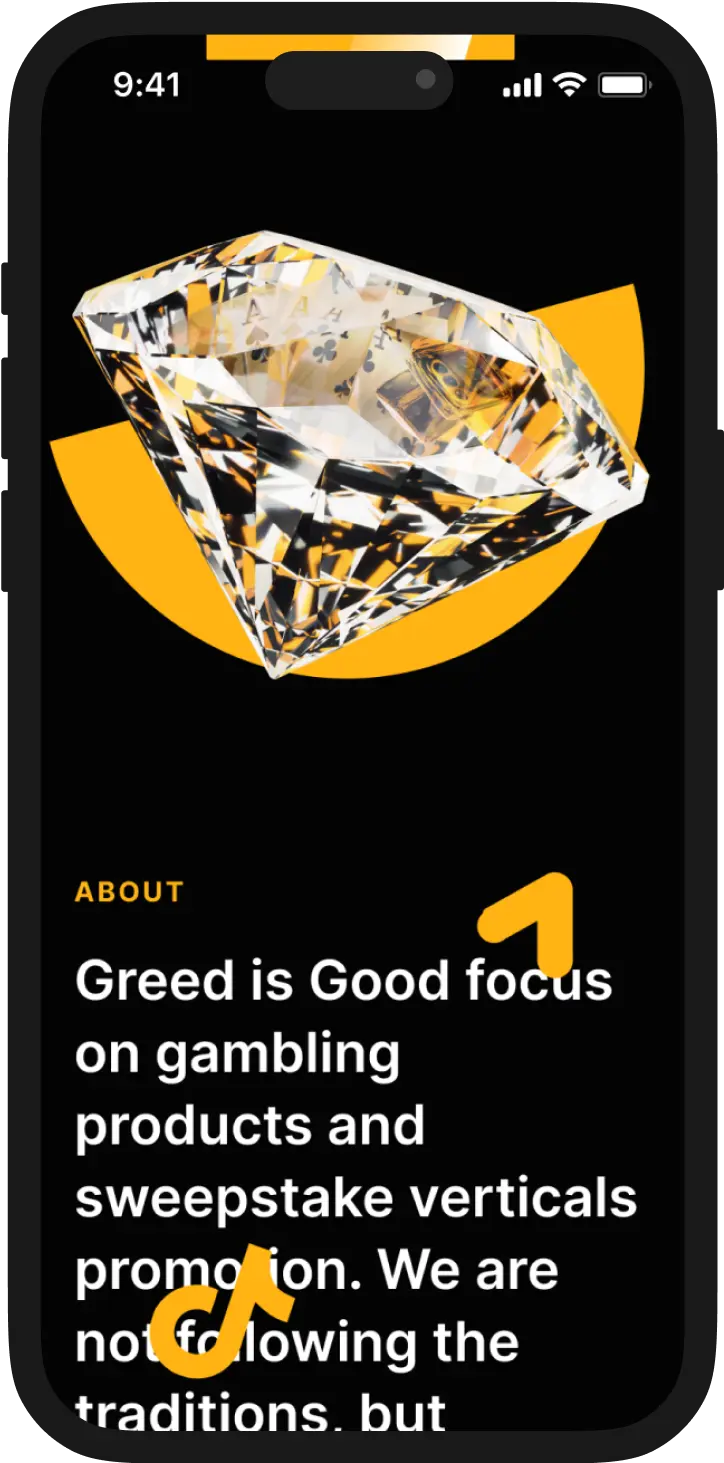
Greed Is Good is a gambling advertising company. The team is engaged in the promotion of games, cryptocurrencies and sweepstakes on the Internet.
At the first stage, we developed the Greed Is Good corporate identity. The main imagery is a thrifty pelican, and semicircular shapes became the basis for the visual and logo. The pelican’s huge beak hints at the desire to get a lot of money.
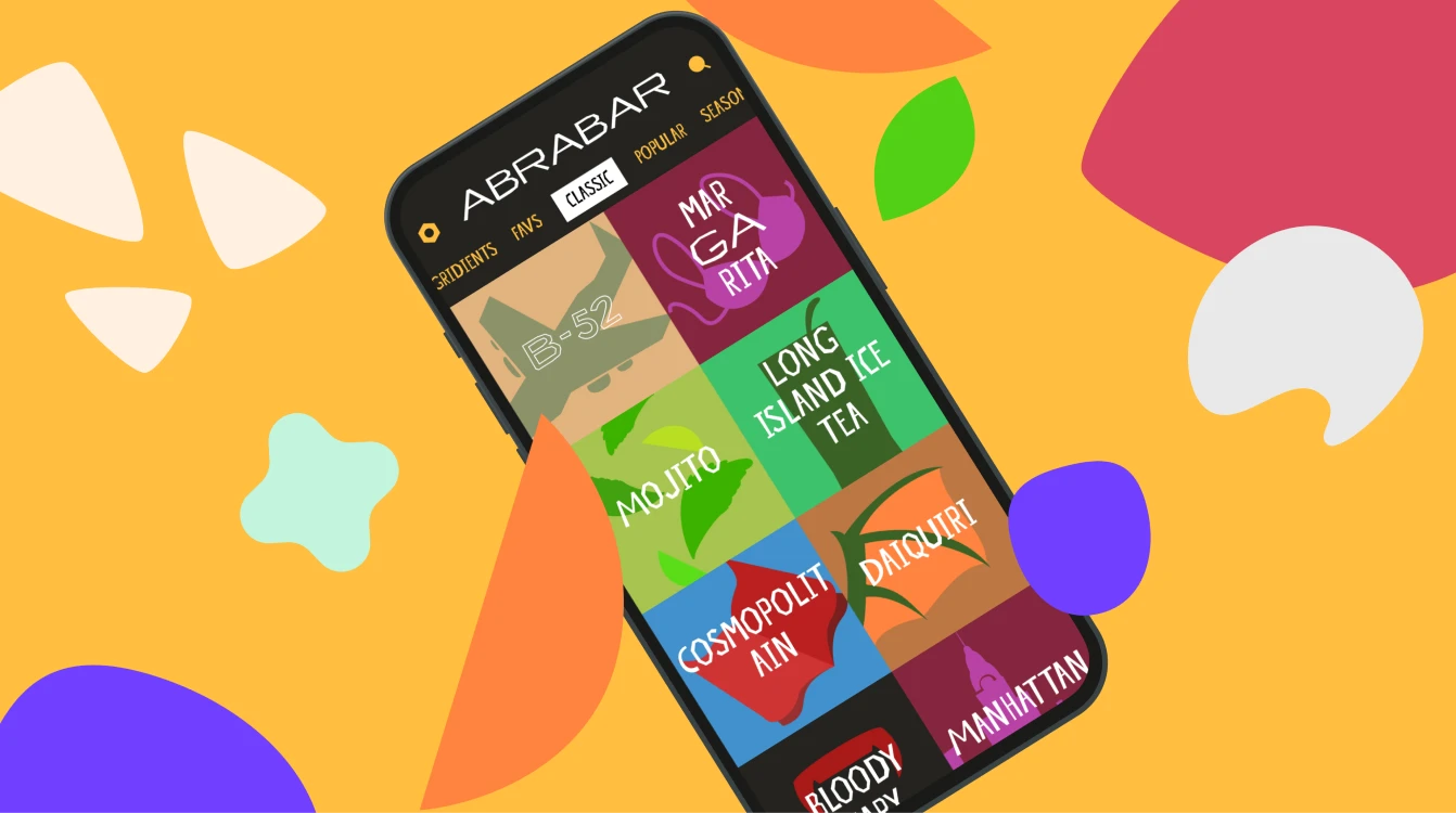
Web, design, content, writing, translating, 3D-illustrations
greedisgood.space

The shape of the semicircle and the yellow color of the beak resemble a half of a coin.
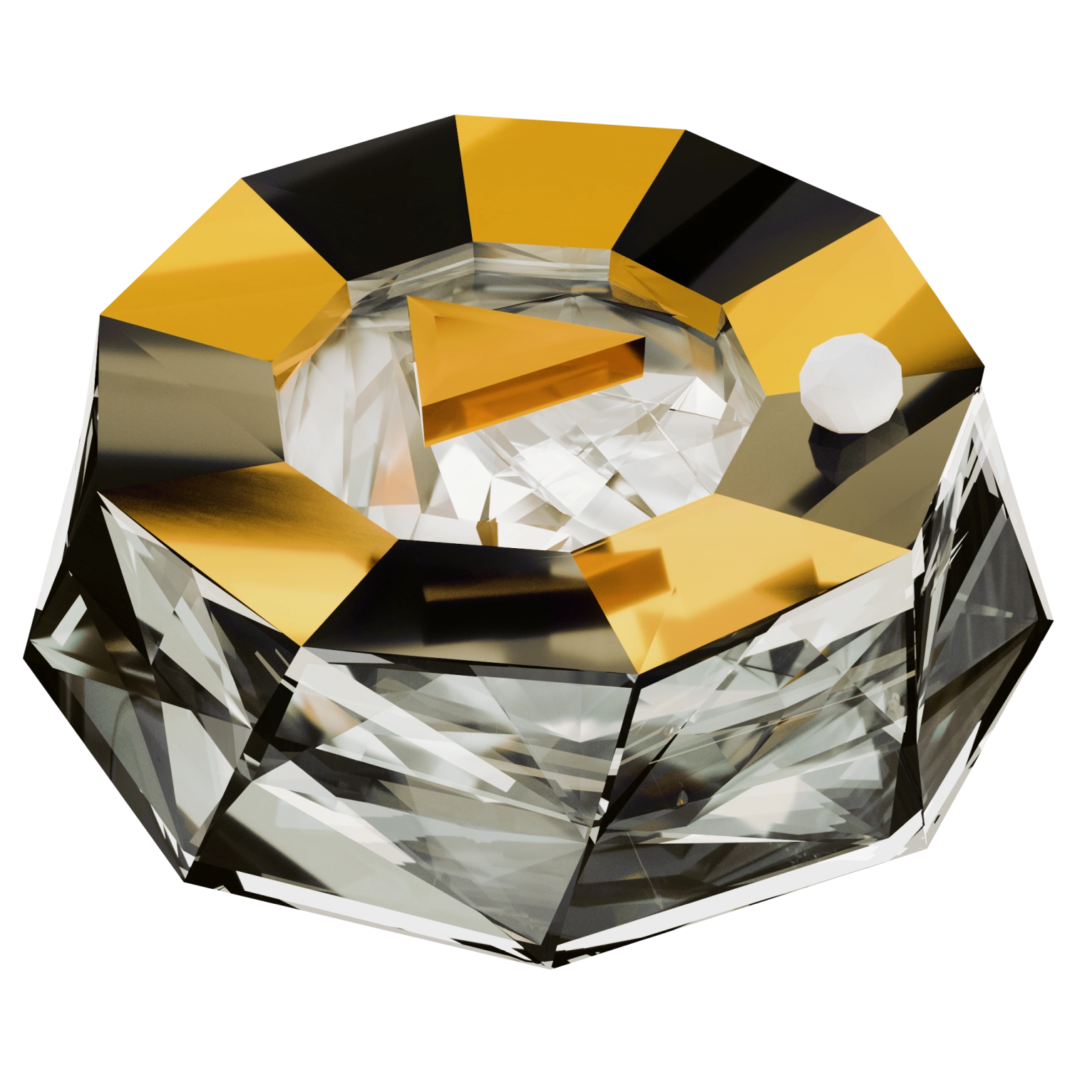
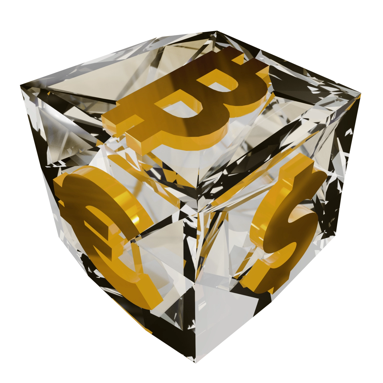
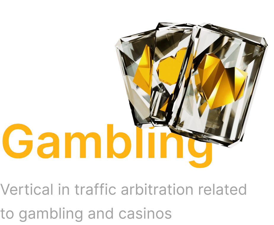
In searching for a design concept, we played on the theme of coins, playing cards and used the comparison with a diamond as a metaphor for the project. The imagery of shiny, successful, and the best perfectly conveys the company's image. A diamond is a stable imagery that is associated with wealth and gambling.
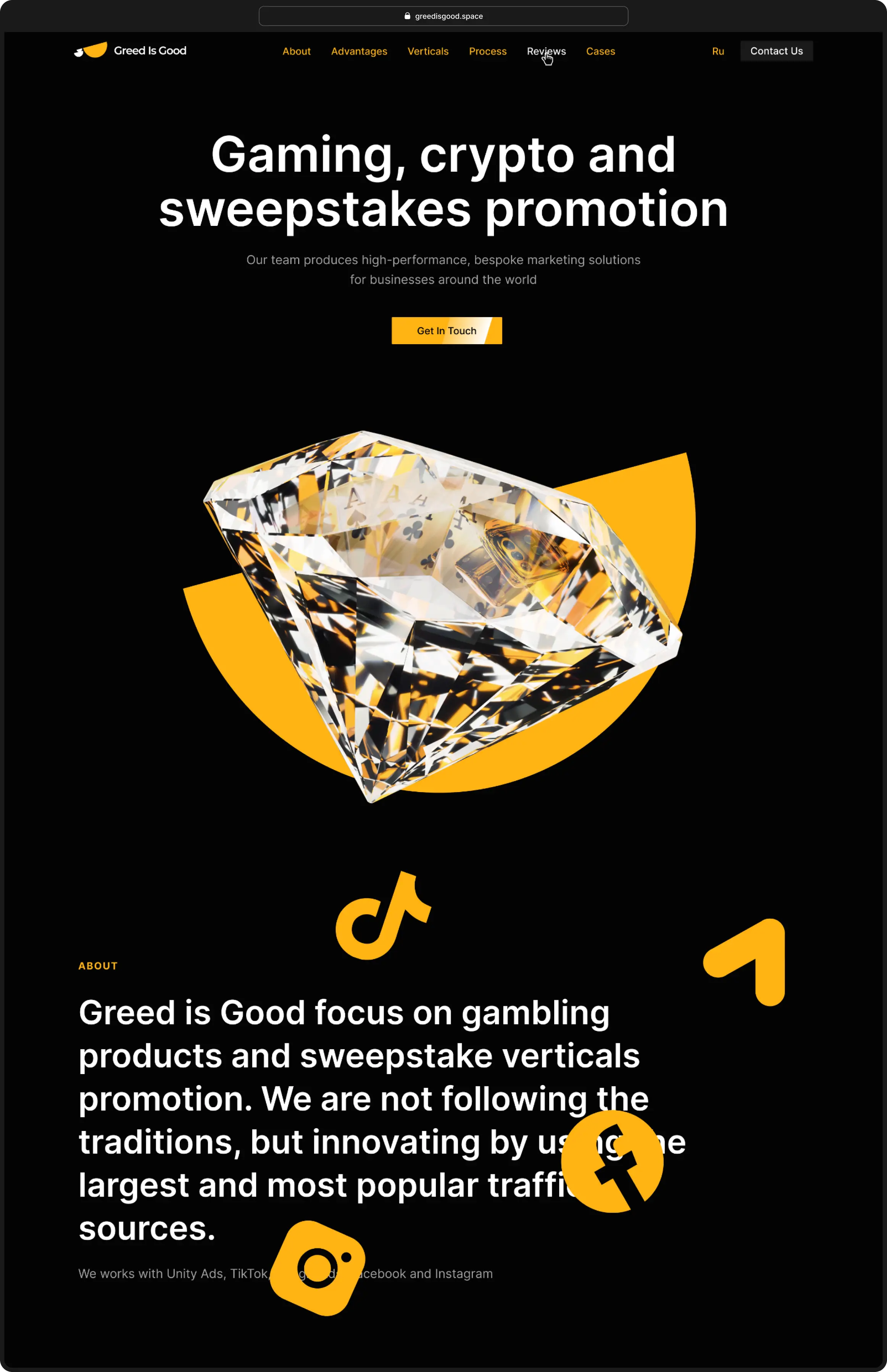
The 3D graphics look impressive due to the good contrast with the gold flat shapes and black background. This simple technique grabs the attention of users and makes the website memorable.

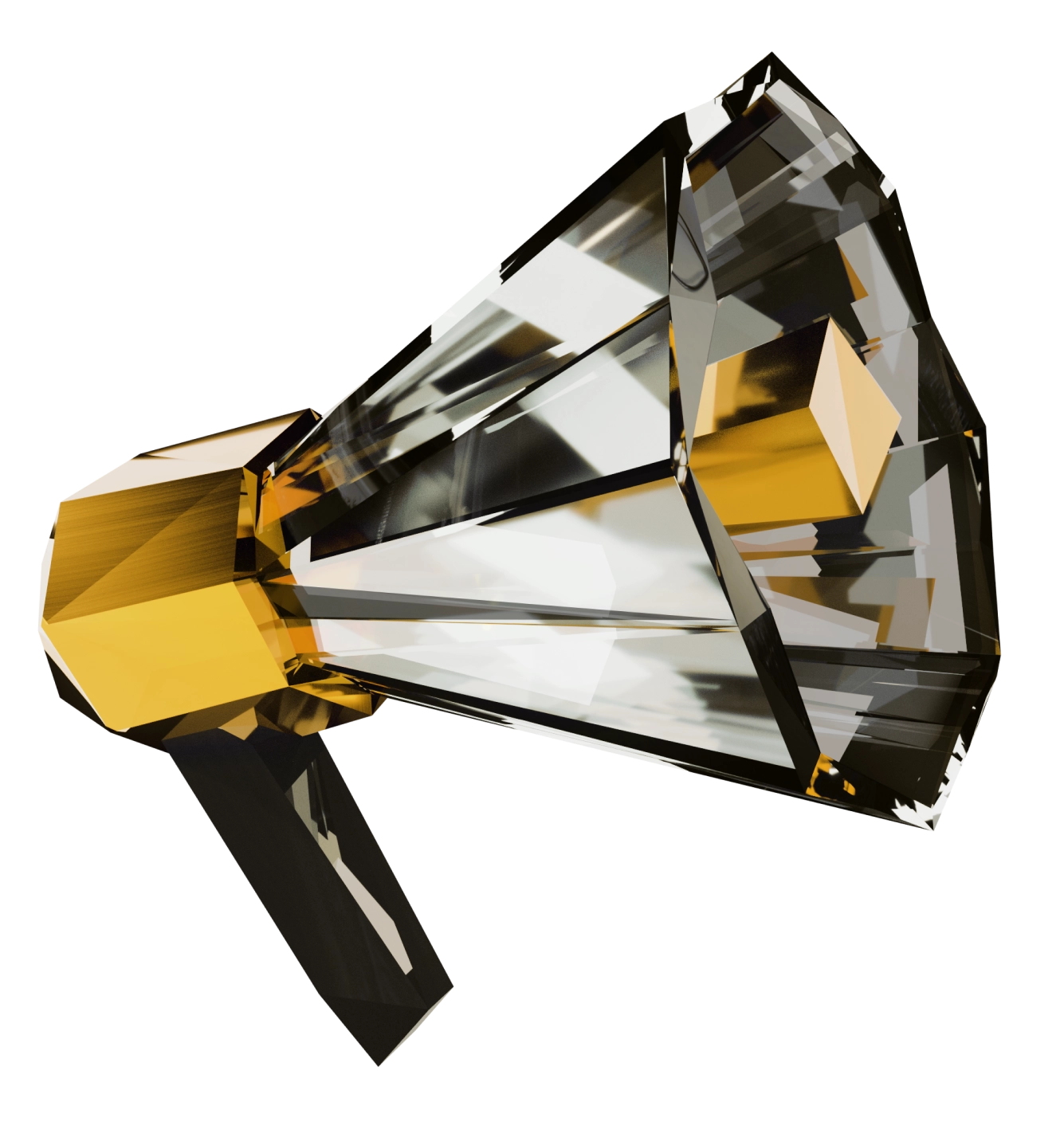
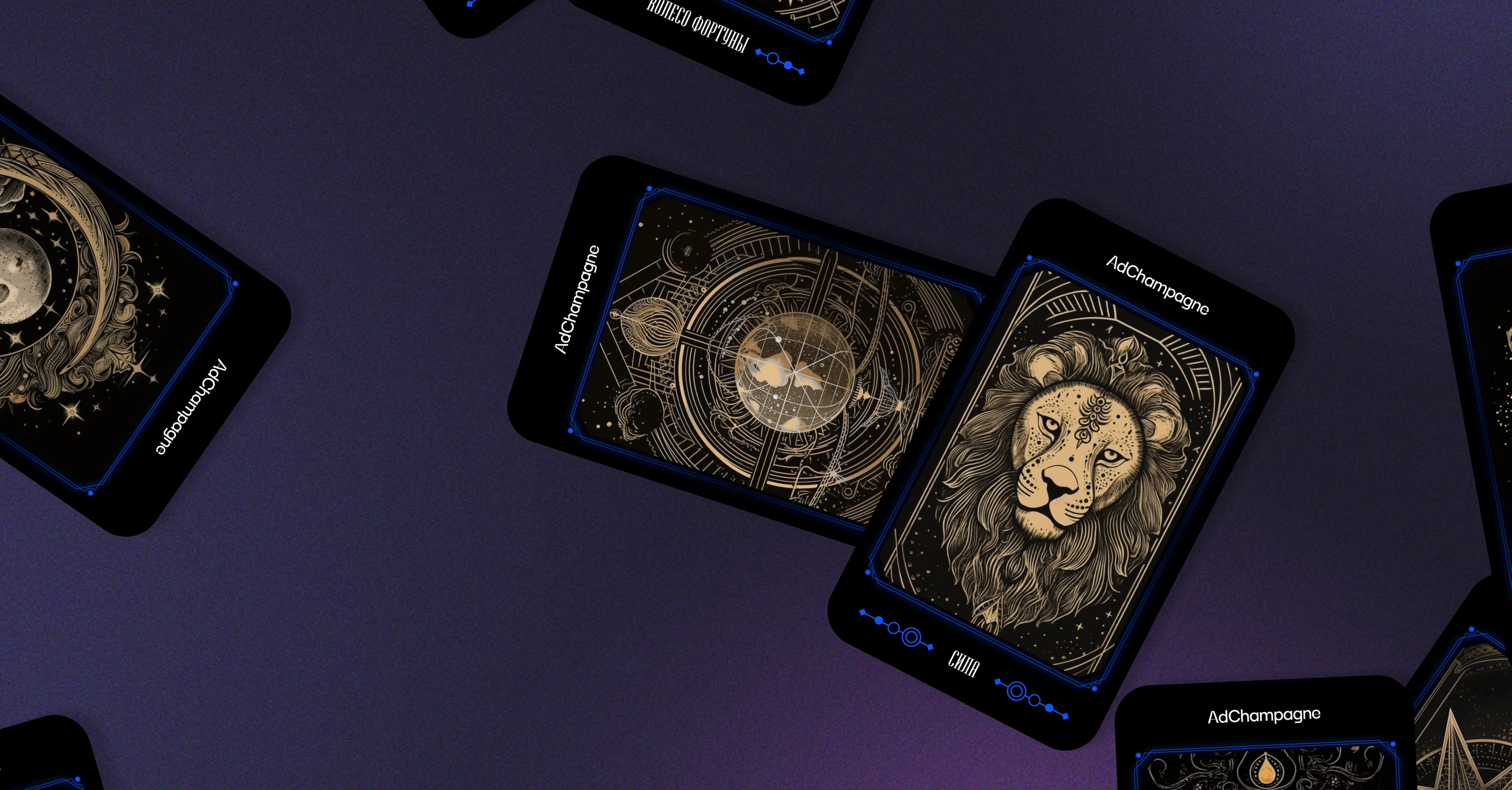
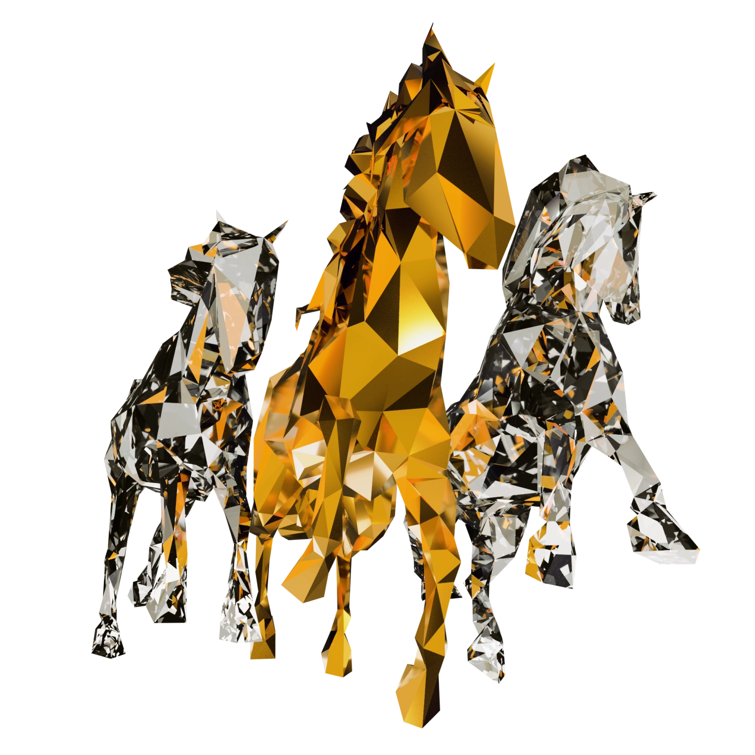
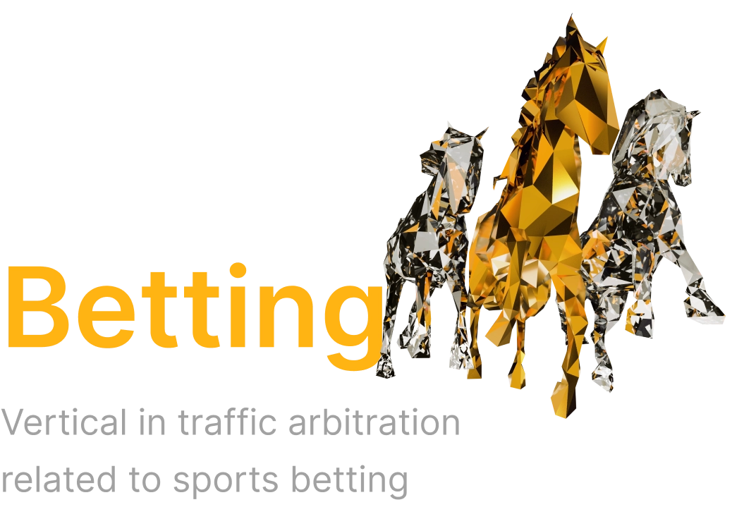
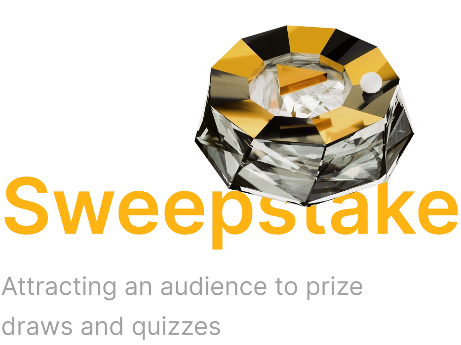
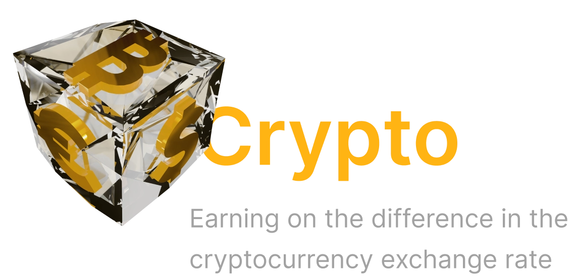
All 3D elements have a diamond texture and play along with the overall concept. We have created a whole gallery of thematic faceted figures: playing cards, horses, dice and other vivid images.
None of the competitors have anything similar. The created illustrations attract attention, you want to look at them and scroll the page to the end.

Betting
Gambling
Sweepstake
Crypto
3D illustrations for a block with company’s fields of expertise
3D illustrations for a block with company’s fields of expertise.
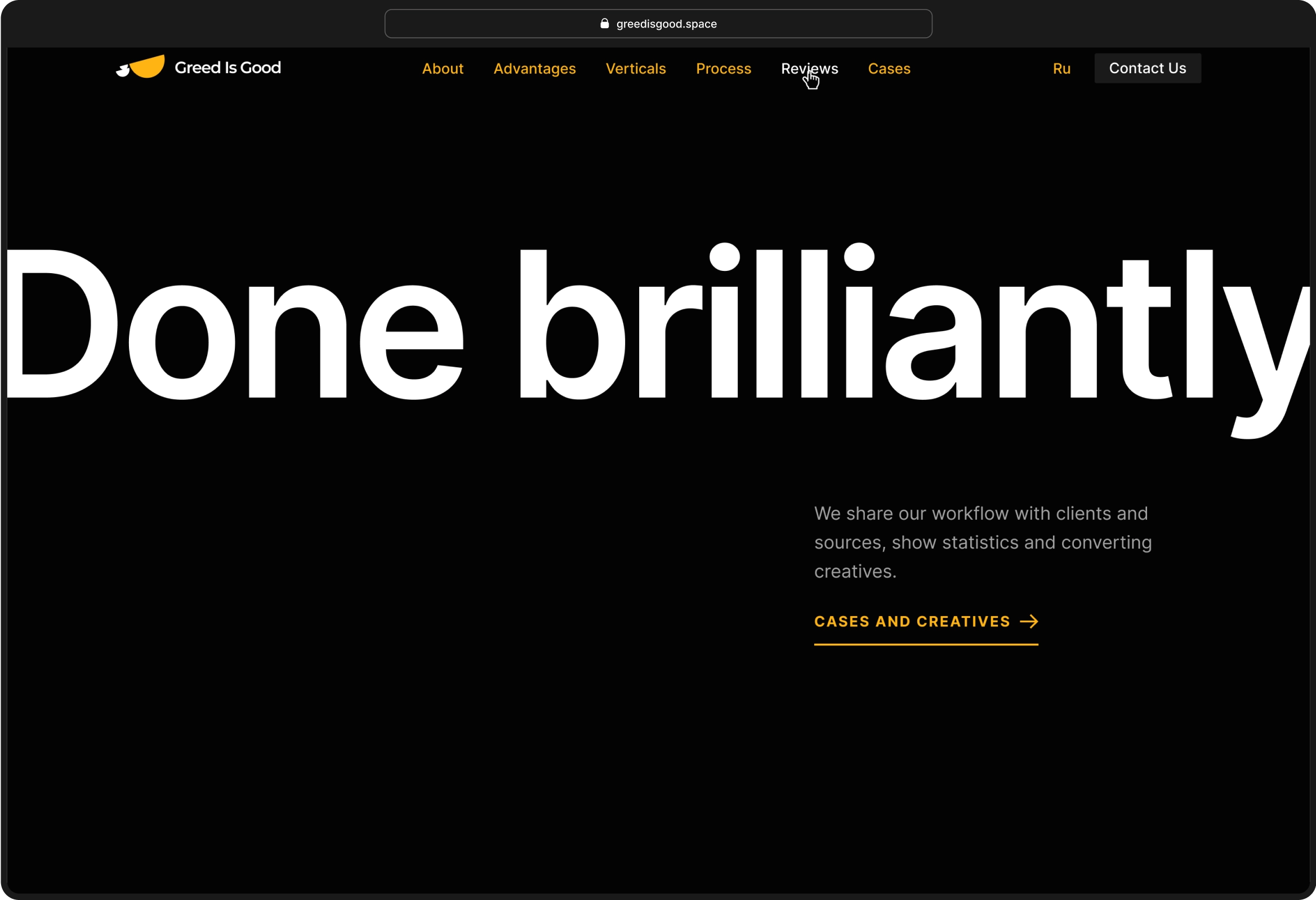
A large composition in the middle of the page catches the eye and adds dynamics to it. This accent block encourages the user to explore Greed Is Good's portfolio. The loud slogan "Done brilliantly" hints at a successful collaboration.
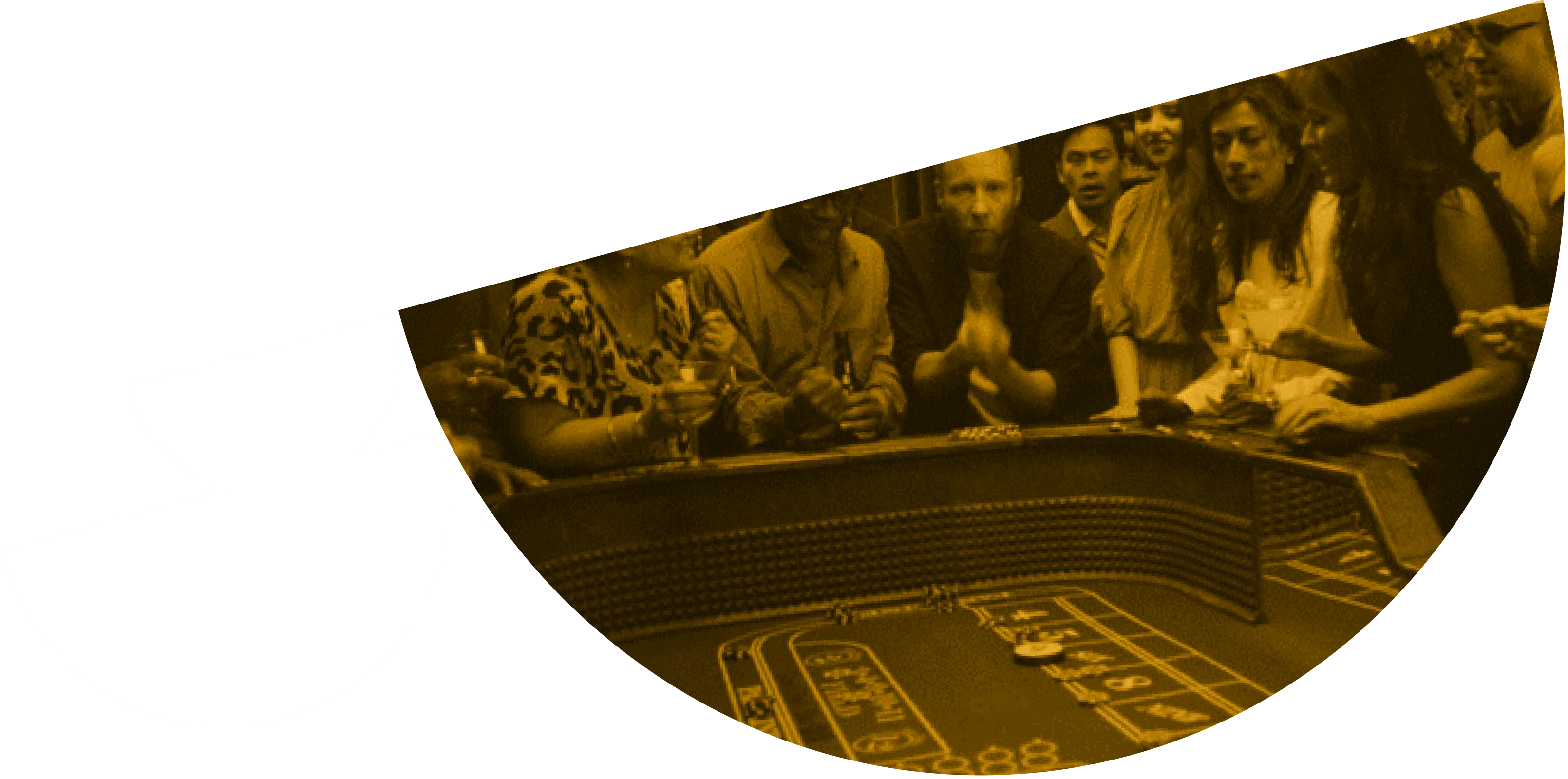
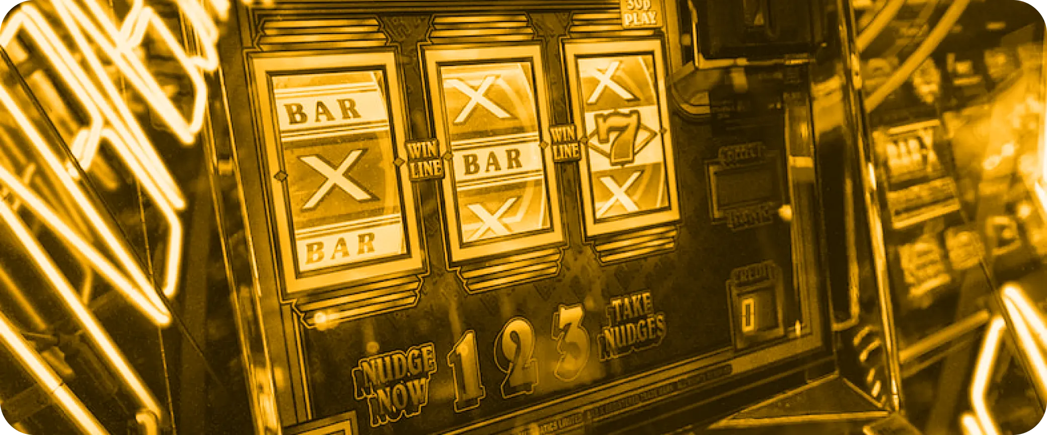
A yellow filter has been added to the photos for a reason. We use it as a metaphor: everything the pelican touches becomes gold.
Greed Is Good's portfolio is quite modest so far, so we have illustrated the cases in large size to make it look like there are a lot of them. We also added filtering by directions so that the user can quickly find a relevant case.
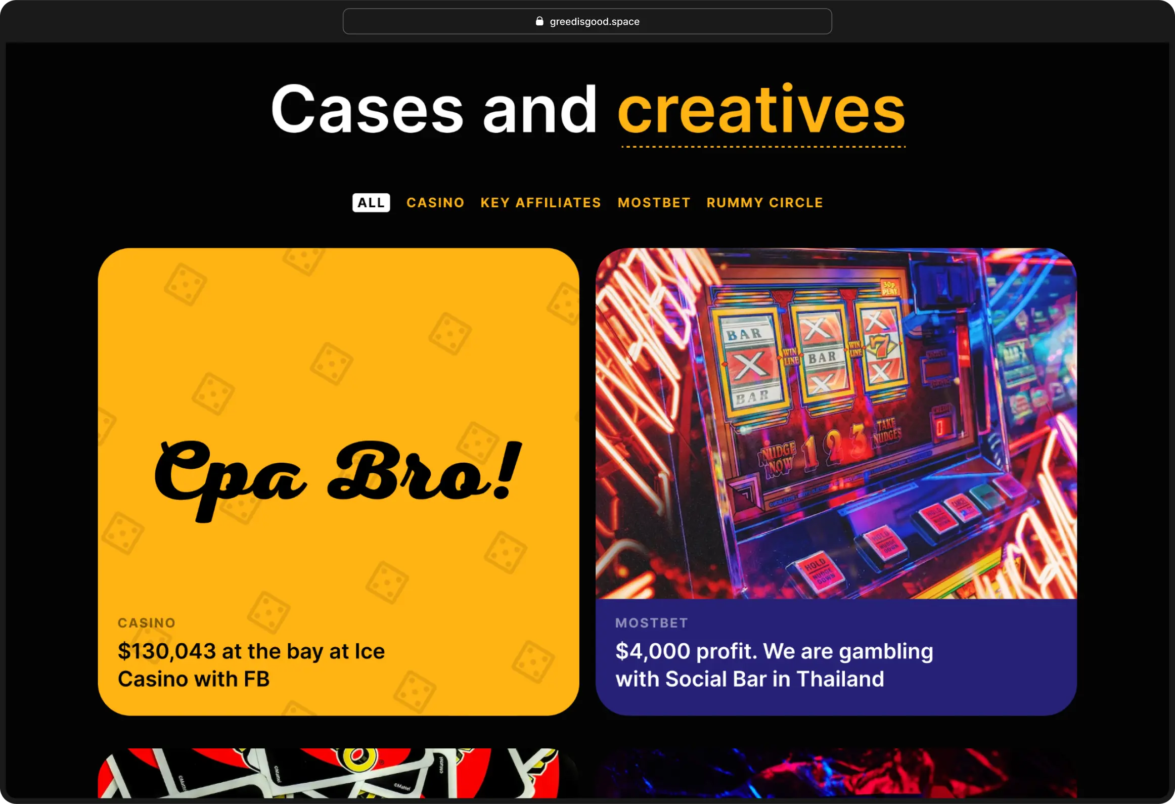
Cases are designed in the format of articles. Indicators are displayed on bars to quickly convey the essence without forcing the user to read the text.
ROI
325,6%
Total received
$5,235
Profit
$4,000
Interesting images, dynamics and textures give the site a modern look, and a gallery of 3D illustrations has become part of the company's corporate identity.
CTO
Vladimir Glotov
Project Manager
Dan Sushentsev
Art Director
Roman Beno
3d and Motion Designers
Team Manager
Dmitry Karmanov
Designers
Ekaterina Chusovlyankina
Igor Melnik
Illustrator, Animation
Vladimir Vdovik
Pavel Pirus
Development
Vladimir Terentev
Nikita Chigin
Case Production
Kamila Bakaeva
Ekaterina Chusovlyankina
Other cases